Skip to content

Inspiring Daily

Discover something new every day. Drop by drop, learn about design, UX science, engineering and product development. If you like this page bookmark and come back every day for a new dose of inspiration
The famous “hamburger” menu icon isn’t as new as you may have assumed

Design

The famous “hamburger” menu icon isn’t as new as you may have assumed

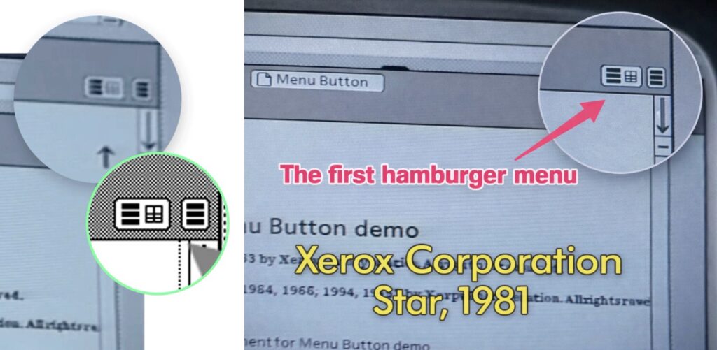
Did you know that the famous “hamburger” menu icon is older than smartphones, older than websites, and, as a matter of chronology, even older than the internet itself?1

The three-lined button, so ubiquitous in mobile and web interfaces, first appeared on the Xerox Star computer in 1981. Designer Norm Cox created the icon to represent a list menu. He chose three stacked bars as a simple, recognisable symbol for hidden options. Soon after, early Xerox users likened it to a hamburger. That’s how the famous “hamburger” icon name came to be. Decades later, the same icon became a design staple in apps, proving the longevity of a good UI idea.

Today, we have many alternatives to the hamburger icon, each representing hidden options, menus, and gateways to more content, but the “hamburger” icon remains the special one. Perhaps because of its appetising name.

If I had asked my stakeholders what they wanted, they would have said faster horses by Henry Ford

Famous Design Quote

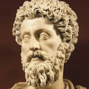
“If I had asked my stakeholders what they wanted, they would have said faster horses.”

— Henry Ford (paraphrased)

testing description Lorem ipsum dolor sit amet, consectetur adipiscing elit, sed do eiusmod tempor incididunt ut labore et dolore magna aliqua. Ut enim ad minim veniam, quis nostrud exercitation ullamco

laboris nisi ut aliquip ex ea commodo consequat. Duis aute irure dolor in reprehenderit in voluptate velit esse cillum dolore

Google Ad placeholder

Paste your AdSense or ad unit markup here when ready.

Video

A Day in the Life of an Ensh*ttificator

Digital products and services keep getting worse. In the new report Breaking Free: Pathways to a fair technological future, the Norwegian Consumer Council has delved into enshittification and how to resist it. The report shows how this phenomenon affects both consumers and society at large, but that it is possible to turn the tide.

Prototypr Logo

Books & Publications

Prototypr – Free knowledge ecosystem for designers and creators

Prototypr is a publishing platform and community where designers, developers, and product people share articles, tools, and ideas related to UX, UI, prototyping, and front-end development.

It started as an independent side project and grew into a widely read platform with thousands of contributors and hundreds of thousands of monthly readers, built around an “open design” philosophy of sharing knowledge freely without paywalls.

Read publication

Read publication (opens in a new tab)

Test 2

Articles

Test 2

fdsaf dsaf dsaf dsaf dsaf dsafdsf dsafdsaf dsaffd

Ut enim ad minim veniam, quis nostrud exercitation

UX Science

Ut enim ad minim veniam, quis nostrud exercitation

Lorem ipsum dolor sit amet, consectetur adipiscing elit, sed do eiusmod tempor incididunt ut labore et dolore magna aliqua. Ut enim ad minim veniam, quis nostrud exercitation

Lorem ipsum dolor sit amet, consectetur adipiscing elit, sed do eiusmod tempor incididunt ut labore et dolore magna aliqua. Ut enim ad minim veniam, quis nostrud exercitation Lorem ipsum dolor sit amet, consectetur adipiscing elit, sed do eiusmod tempor incididunt ut labore et dolore magna aliqua. Ut enim ad minim veniam, quis nostrud exercitation

Design Tools

UX Pilot AI

UX Pilot AI

If you need a quick way to turn ideas into actual designs without spending hours pushing pixels, UX Pilot AI might be exactly what you’re after.

It’s particularly useful when you already have a clear direction in mind and can describe it well, as the tool responds best to specific, structured prompts and can generate solid wireframes and layouts in minutes.

You can learn more about UX Pilot here.

Pause to Respond

Images

Don’t rush to react, instead pause to respond

This image feels like a quiet roast of how we often approach design. The same dots start off innocent enough, then we panic, open Figma, add five components, three stakeholder opinions, and suddenly we have a tangled mess that no one fully understands. Yet, with a bit of patience and restraint, the chaos somehow turns into a neat little star, as if it was always meant to be there. It is a gentle reminder that good UX is less about doing more and more about not doing too much too quickly. Sometimes the most sophisticated move in design is simply to stop, breathe, and not make things worse.

Google Ad placeholder

Paste your AdSense or ad unit markup here when ready.

Users always know what they want

Busting UX Myth

Users always know what they want

If users truly knew what they wanted, every first date would end in marriage, and no one would have ever regretted buying a treadmill. The truth is, users think they know what they want, but their actions often say otherwise.

Take the infamous example of the “faster horse” attributed to Henry Ford. If he had taken that request literally, we’d still be designing luxury saddles instead of self-driving cars. Instead of trusting every user request like gospel, watch what people actually do. Because, let’s be honest, if users really knew what they wanted, the “Undo” button wouldn’t be the most clicked button in every design tool.

MT Contemplation

Nothing has been added here yet.